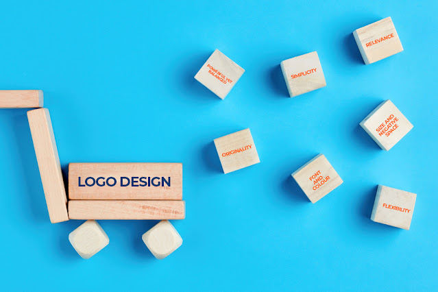
7 Rules of Logo Design Every Graphic Designing Company Follows

Your brand logo is the face of your company that tastefully represents who you are. It is an essential component of branding and is literally visible everywhere – on your office building, letter head, stamps, visiting cards, email signatures, your products and office stationery. To align the company vision and integral values with the logo design, any graphic design company in India is bound to include certain key components in the logo. So, here they are! 1. Powerful yet, Balanced. Your logo is going to be everywhere and if its going places, then it should give out a powerful message. Strong and balanced logos are easy to adapt to products, stationery and advertisements. They are naturally appealing to the human eye. The FedEx logo is a great example of a balanced logo. No matter what you end up choosing - just text or graphic or both. Make sure you select the one that is attractive and effective in reflecting your business and its soul. 2....
