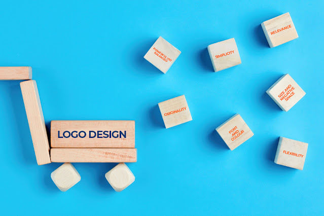
7 Rules of Logo Design Every Graphic Designing Company Follows
To align the
company vision and integral values with the logo design, any graphic
design company in India
is bound to include certain key components in the logo.
So, here they
are!
1.
Powerful yet,
Balanced.
Your logo is going to be everywhere and if its going places, then it should give out a powerful message. Strong and balanced logos are easy to adapt to products, stationery and advertisements. They are naturally appealing to the human eye.
The FedEx logo is a great example of a balanced logo.
No matter what you end up choosing - just text or graphic or both. Make sure you select the one that is attractive and effective in reflecting your business and its soul.
2.
Simplicity.
“Simplicity is about bringing order to complexity.” – Jononthan Ives
Clean, clear and simple logos are most effective in connecting with the audience. They send a direct message that is easy to understand even when it catches the viewer’s attention for a short span.
Most of the successful brands have a simple logo – Nike, Apple, McDonalds, BBC, Mercedes.
There may not be a lot of elements in the logo, but it is immediately recognizable and on deeper inspection reveals a lot about the company history. And a simple characteristic like a bite in the apple logo is enough to generate curiosity.
3.
Relevance.
Strong first impressions will last only if the logo is meaningful to your business. It has to reveal your identity in an appropriate way. If the message is lost in attraction, then the logo is ineffective.
The design must speak to your customers and be relevant to your industry. The simple swoosh of the Nike logo represents movement, innovation and change which is quite relevant to the footwear/activewear brand.
4.
Originality.
Escape the rut. Be unique.
Your company logo should leave a memorable impression. Choose a reputed agency for graphic design services in India. They design logos from scratch and use proper fonts, colours and symbols to reflect your company.
If you get your logo designed for cheap, it is likely to cost you dearly in the long run.
5.
Font and Colour.
Font or typography plays an important role in branding. It reflects the essence of the brand and the industry values.
Imagine a comic font on a law firm logo or a robotic font on a cosmetic brand. It just does not send the right message. The customers may not take the law firm seriously and the shoppers will find no allure in the cosmetics.
If you are going for colours in the logo, then they should deepen the message and create the right appeal. Green suggests nature/cleanliness, blue represents clarity/freshness, purple represents power and so on. Note that having a lot of colours will not be cost effective if you consider the printing charges on your stationery and more.
6.
Size and Negative
Space.
Think about fitting a very big logo on your company pens! Shrinking it can reduce legibility.
Test the logo at different sizes and virtually on a number of stationery items as well before you finalize. It is also important to have negative space. If you try to show and say a lot of things in the logo, it will end up as a cluttered mess. Connecting with the customer’s mind requires clarity, simplicity and space.
7.
Flexibility.
Lastly,
your logo should easily adapt to the various platforms where it appears – your
website, products, stationery etc. It should be legible and attractive even
when small (think pens) or huge (think hoardings). Logo should be adaptive to
both black and white forms for visibility on light/dark backgrounds.


Thank you for sharing the valuable information.
ReplyDeleteAt Xelex, we provide best branding companies in hyderabad and make a highly valuable markable image of your brand on your customers, accordingly to gain customers' attention and loyalty.